
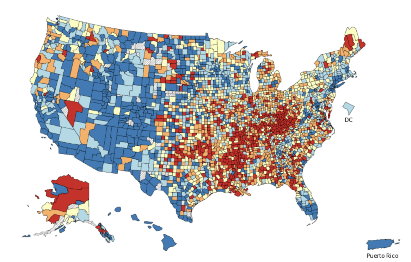
Cancer Maps—An Expensive Source of Phantom Patterns?
Is the money the U.S. government spends on tracking cancer patterns a good investment? There’s a way we can tellThe U.S. government puts interactive maps on the internet that show the geographic incidence (all the way down to census blocks) of various types of cancer. Millions of dollars are spent each year maintaining these maps, but for what purpose?
The problem with cancer maps is that they tempt the curious and fearful to scrutinize the brightly colored chunks, thinking that any patterns they discover must be meaningful. However, statistical patterns are sometimes meaningless. For example, I flipped a coin ten times and got these results:

There is a cluster of 3 heads in a row and a cluster of 4 tails in a row:
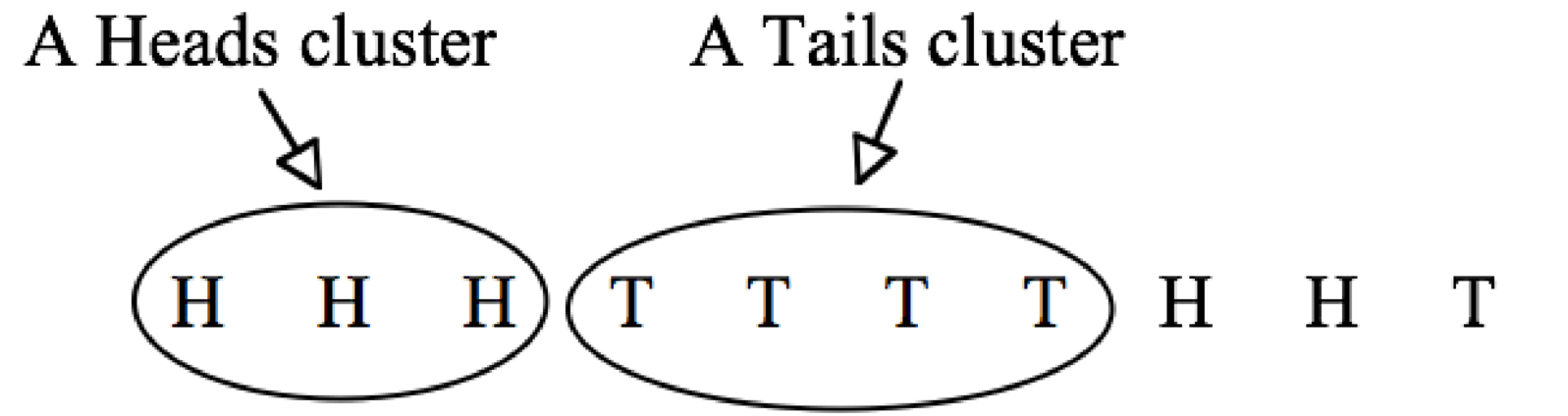
These clusters are not at all surprising. If a fair coin is flipped ten times, there is a 47 percent chance of a streak or at least four heads in a row or four tails in a row. Of course, these are coin flips, not cancer data. But that is exactly the point! Because clusters can be found in any randomly generated data, cancer clusters may well be coincidental, too.
Even if every single person in a country is equally likely to die of cancer, just like every flip is equally likely to be heads or tails, there will, more likely than not, be geographic clusters of victims. To demonstrate this, I created a fictitious city with 10,000 residents living in homes evenly spaced throughout the city, each having a one-in-a-hundred chance of dying of cancer. (I ignored the fact that people live in families and that cancer deaths are related to age.) I used a random number generator (essentially a bent coin with a one-in-a-hundred chance of heads) to determine the cancer victims in this imaginary town. The resulting cancer map is shown below.
Each black dot represents the home of a cancer victim. There are no cancer deaths in the white spaces.
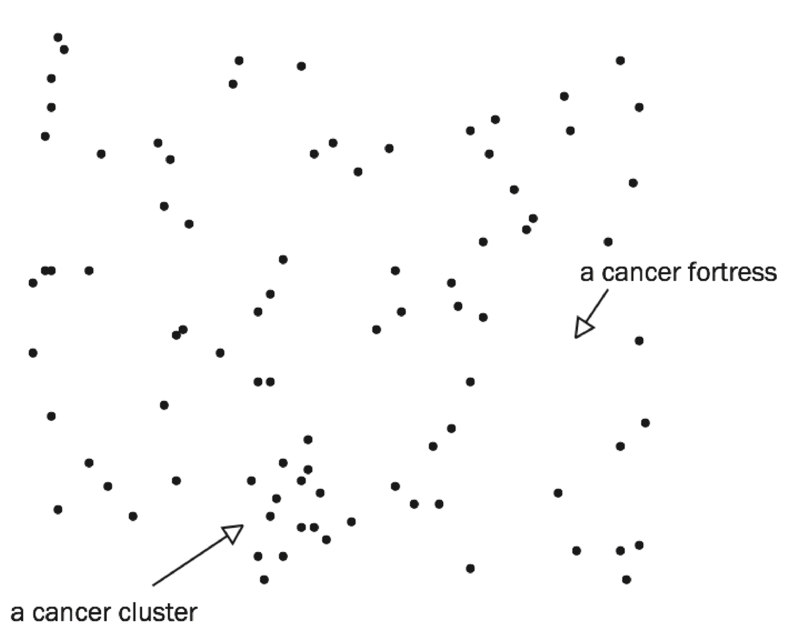
There is clearly a cancer cluster in the lower part of the map. If this were a real city, we could drive through this cancer-cluster neighborhood and find something special. Perhaps the city’s Little League fields are nearby. If we now compare cancer rates for people who live near the Little League fields with cancer rates for people who live far away, guess what? Cancer rates are higher near the fields, suggesting that living near a Little League field causes cancer.
My randomly generated cancer map also shows a cancer fortress, a part of town where nobody has cancer. If we drive through this cancer-free neighborhood, we are sure to find something. Perhaps, the town’s water tower is nearby. If we now compare the cancer rates for people who live near the water tower with cancer rates for people who live far away, cancer rates are of course lower near the water tower. That’s why we chose this neighborhood. Because nobody there has cancer.
In each case, near the Little League fields or near the water tower, we have the same problem. If we use the data to invent the theory (Little League fields cause cancer, water towers protect against cancer), then of course the data support the theory! How could it be otherwise? Would we make up a theory that did not fit the data? Of course not.
It is the same with the U.S. government’s interactive maps. The National Institutes of Health web site has cancer rates for twenty-two different types of cancer, two sexes, four age groups, six races and ethnicities, and more than three thousand counties. With millions of possible cancer clusters, some are bound to appear, just by chance alone. Some places will have above-average cancer rates and other places will have below-average rates, just as in 100,000 coin flips there are bound to be places where there happen to be 9 or 10 heads in a row and other places where there happen to be 9 or 10 tails in a row.
The U. S. government not only spends millions of dollars on its cancer maps, the Center for Disease Control has a web page where people can report cancer clusters that they discover in these maps. More than a thousand cancer clusters are reported and investigated each year even though the CDC cautions that, “Follow-up investigations can be done, but can take years to complete and the results are generally inconclusive (i.e., usually, no cause is found).”
Cancer clusters are an expensive example of the perils of ransacking data for patterns and then, after the fact, inventing explanations for the patterns that are discovered. Since there are meaningless patterns even in random data, the only thing that the discovery of a pattern proves is that we spent time looking for one. For a pattern to be persuasive evidence, we need to specify beforehand a plausible theory and the empirical patterns that would support the theory and those that would contradict the theory, and then look at the data. Anything else is unconvincing.
That is precisely the problem with data-mining algorithms that search for patterns unguided by human expertise. The algorithms are sure to find patterns much faster and far more often than human searches would but they have no way of assessing the plausibility of what they discover.
Put the algorithm inside a black box and you may unknowingly be predicting cancer deaths based on water towers. Asking a black box algorithm to evaluate job applicants, assess loan applications, price car insurance, predict criminal behavior, forecast stock prices, or recommend a medical treatment is asking for trouble.
Note: Gary Smith and Jay Cordes are the authors of The Phantom Pattern Problem. (Oxford, October 1, 2020) See: “New book outlines the perils of Big (meaningless) Data
You may also wish to look at:
In science, we can’t just “settle” for data clusters. The board game, Settlers of Catan, offers a clear illustration of what can go wrong when we are duped by data clusters (Gary Smith and Jay Cordes)
and
The decline effect: Why most medical treatments are disappointing. Artificial intelligence is not an answer to this problem, as Walmart may soon discover. (Gary Smith)