
A Graph Can Tell a Story—Sometimes It’s an Illusion
Mistakes, chicanery, and "chartjunk" can undermine the usefulness of graphsA picture is said to be worth a thousand words. A graph can be worth a thousand numbers. Graphs are, as Edward Tufte titled his wonderful book, the “visual display of quantitative information.” Graphs should assist our understanding of the data we are using. Graphs can help us identify tendencies, patterns, trends, and relationships. They should display data accurately and encourage viewers to think about the data rather than admire the artwork. Unfortunately, graphs are sometimes marred (intentionally or unintentionally) by a variety of misleading techniques or by what Tufte calls “chartjunk” that obscures rather than illuminates.
I have described elsewhere many ways in which mistakes, chicanery, and chartjunk can undermine the usefulness of graphs. I recently saw a novel example that I have not written about before.
ChatGPT and other large language models (LLMs) are all the rage now, with many people believing that we are close to the holy grail of artificial general intelligence (AGI) in which computers can do any intellectual task that humans can do. I remain deeply skeptical. LLMs are just text generators. It is astonishing how well they do this narrow task but they are not intended to and do not understand any of the text they input and output. They consequently have no way of knowing whether the text they generate is true or false, let alone applying critical thinking. LLMs have improved greatly as they have scaled up on larger and larger text databases and been trained more extensively by human handlers. True believers argue that further scaling will lead to AGI. I and other skeptics argue that scaling will not solve the fundamental roadblock—that LLMs do not understand the meaning of words and how these relate to the real world.
LLMs and “Emergence”
A recent paper (with 16 coauthors from Google, Stanford, UNC Chapel Hill, and DeepMind) argues that scaling up can qualitatively change the abilities of LLMs, what the authors call emergence:
Emergence is when quantitative changes in a system result in qualitative changes in behavior.
The authors explain:
Here we will explore emergence with respect to model scale, as measured by training compute and number of model parameters. Specifically, we define emergent abilities of large language models as abilities that are not present in smaller-scale models but are present in large-scale models; thus they cannot be predicted by simply extrapolating the performance improvements on smaller-scale models.
They report finding thresholds beyond which additional scaling causes an explosive change in the models’ performance. They conclude that
The existence of such emergence raises the question of whether additional scaling could potentially further expand the range of capabilities of language models.
Much of their evidence is presented in graphs like this one, where the number of model parameters is on the horizontal axis and the model’s accuracy is on the vertical axis:
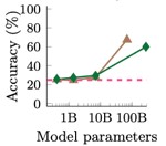
The visual impression is, indeed, that scaling up has modest effects until a tipping point is reached and then performance improves dramatically. Readers must look closely to notice that the horizontal axis is logarithmic. In a simple scatter plot of Y versus X, the slope of a fitted line measures the predicted change in Y associated with a one-unit increase in X. Graphs are sometimes drawn with the log of Y on the vertical axis; in this case, the slope of a fitted line measures the predicted rate of change of Y associated with a one-unit increase in X. What does a fitted line mean when the log of X is on the horizontal axis?
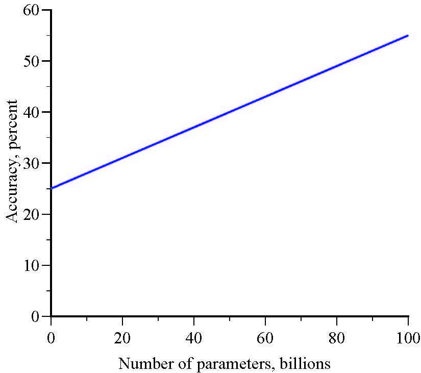
Suppose that accuracy is a linear function of the number of parameters, evaluated at very different scale levels:
Y=25 + 0.3X
A graph of accuracy versus the number of parameters is linear:
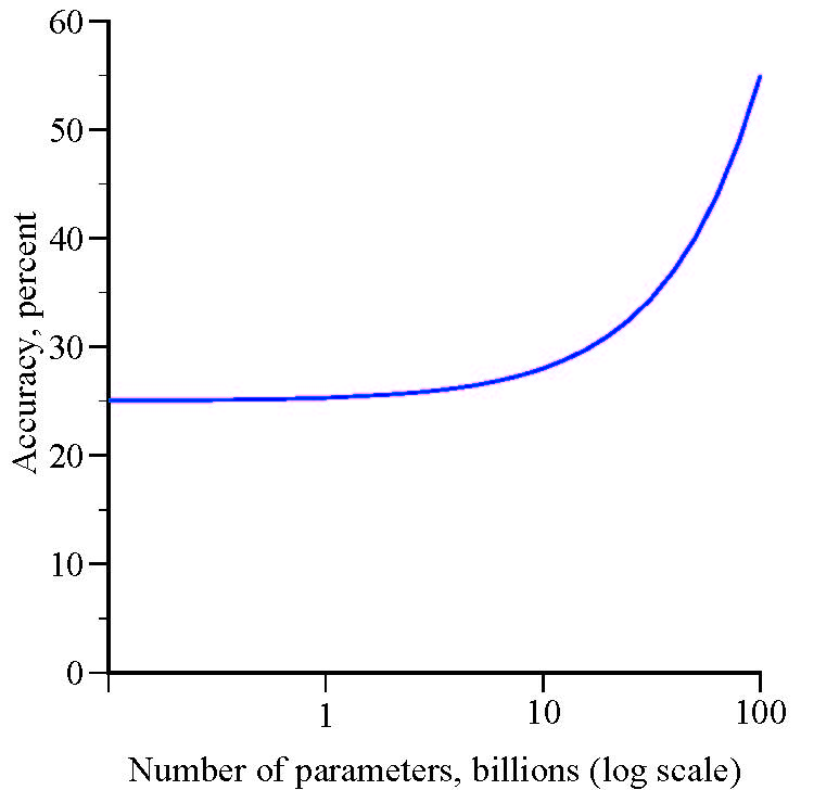
But, a graph of accuracy versus the log of the number of parameters gives the illusion of an emergence threshold:
An Optical Illusion?
The Y variable (accuracy) increases modestly until it evidently hits a threshold and explodes. The apparent threshold is just an optical illusion. There is no emergence in which quantitative changes in the number of parameters result in qualitative changes in model accuracy. Despite the visual impression, it is not true, as the authors claim, that a model’s abilities “cannot be predicted by simply extrapolating the performance improvements on smaller-scale models.” Here, model abilities can be predicted perfectly by extrapolating from small-scale performance.
The crux of the disconnect is that when one variable, X, has a stable, predictable, positive effect on another variable, Y, with no thresholds or tipping points, small changes in X have small effects on Y and large changes in X have large effects on Y. If the variables are graphed, with the logarithm of X on the horizontal axis, it will appear that small changes in X have increasingly larger effects on Y.
I do not know whether this model or some other model is a better representation of the relationship between scaling and model performance but I do know that figures with logarithms on the horizontal axis can be terribly misleading.