Let’s Dispose of Exploding Pie Charts
Pie charts are seldom a good idea. Here's why.A picture can be worth a thousand words. A graph can be worth a thousand numbers. Unfortunately, pictures and words can be deceptive — either intentionally or unintentionally.
One common type of deception involves the use of two- or three-dimensional figures to represent single numbers. For example, the Washington Post once used the figure below to illustrate how inflation had eroded the purchasing power of the U.S. dollar between 1958 and 1978. To make the figure memorable, each of the dollar bills contained a photo of the U.S. President that year in place of the George Washington image that actually appears on the $1 bill.
Washington Post, October 25, 1978
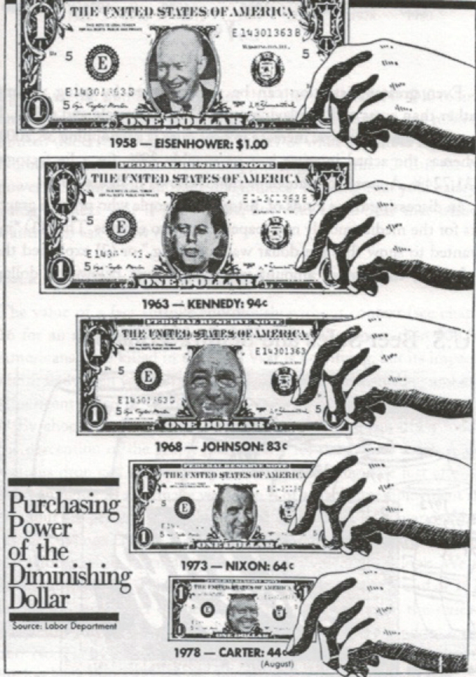
Prices more than doubled between 1958 (when Dwight Eisenhower was President) and 1978 (when Jimmy Carter was President), and this doubling of prices reduced the purchasing power of a dollar by a bit more than half. The complete set of data could have been shown in a simple table like this:
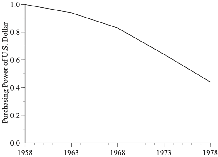
Purchasing Power
1958 1.00
1963 0.94
1968 0.83
1973 0.64
1978 0.44
or in a plain-vanilla graph like this:
Boring! Dollar bills with presidential faces are definitely more eye-catching. The problem is that they are also terribly misleading. The height of the Eisenhower dollar bill is slightly more than twice the height of the Carter dollar bill because a dollar’s purchasing power in 1958 was a bit more than double what it was in 1978. However, if the height of the Eisenhower bill had been doubled with no change in its width, the bill would have been terribly distorted, like a funhouse mirror. To make the dollar bill look a dollar bill without distortion, the width of the Eisenhower dollar had to be doubled too.
Doubling the height and doubling the width quadruples the area of the bill, which tricks us into thinking that the purchasing power of a dollar in 1958 was more than four times its purchasing power in 1978. The Post’s well-intentioned effort to garner attention resulted in a misleading graphic.
The Wall Street Journal used a variation on this deception in its December 30/31, 2023, issue. The authors had scrutinized Auburn University’s budgets from 2002 through 2016 to see where the hundreds of millions of dollars that had been added to the budget had been spent. They found that “much of the money went toward administrative salaries, buildings and, no surprise, sports.”
The Journal used a series of pie charts to illustrate their findings. One example is here:
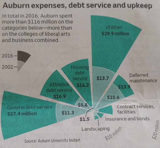
A standard pie chart shows a single pie with the areas of the pie slices used to compare categories. If the money spent on utilities is twice that spent on housing debt service than the size of the utilities slice is twice the size of the housing slice.
Pie charts are seldom a good idea. If there are only a few numbers, a simple sentence will say what needs to be said. If there are lots of numbers, a pie chart is likely to be cluttered and confusing and a simple table will be far more effective at conveying information.
Nonetheless, the Journal used pie charts. However, instead of using two pies to compare the composition of spending in 2002 and 2016, the Journal put the numbers for both years in a single graphic, using the radius (rather than the area) of each slice to compare categories. This has the (evidently desired) effect of showing an explosive growth of spending. This visual impression is effective but misleading.
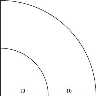
Since the Journal graphic is so cluttered, consider this simple example. Suppose that the total budget doubled between 2002 and 2016, from $40 million to $80 million, and that, in each year, a quarter of the total budget was spent on utilities: $10 million in 2002 and $20 million in 2016. The pie graphic below reflects those numbers but, since the area of a circle is proportional to the square of the radius, a doubling of spending quadruples the size of the pie slice, thereby exaggerating the visual impression of how much spending has increased.
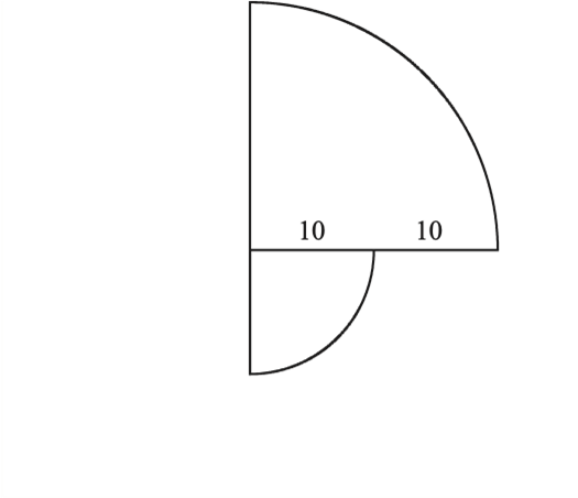
This same visual magnification occurs when two categories are compared. In the graphic below, the large pie slice reflects spending that is twice the spending in the category represented by the small slice, but the large slice is four times the size of the small slice:
The Journal’s exploding pie chart exaggerates not only a comparison of 2016 spending with 2002 spending but also a comparison of spending in large categories with spending in small categories.
I am certainly sympathetic to the Journal’s conclusion. There has been an unconscionable explosion in college and university spending that is either unrelated or detrimental to their purported educational goals. Money flows to bloated bureaucracies, lavish buildings and, of course, sports while tuition soars, faculty compensation languishes, and there is an increased reliance on poorly paid part-time faculty.
However, these points can be made without sensationalized graphs that undermine the credibility of the argument. Let’s dispose of exploding pie charts.