Don’t Leave Home Without These Three Curves
Three mathematical curves explain a lot of what happens—and doesn’t happen—in everyday lifeOne of the problems with modern secondary mathematics education is that it teaches lots of details about how to solve problems but provides very little insight into how to understand problems. You may have learned to solve a quadratic equation but you may not have learned what life situations generate a quadratic equation. Here we are going to discuss three very important curves, and also how they are confused with each other—straight lines, exponential curves, and S-curves.
The Humble Line

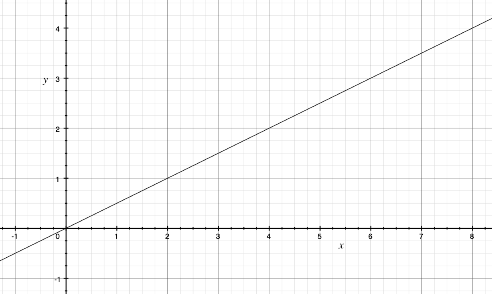
A straight line is the most basic curve you can get (and, since it doesn’t curve, some people do not classify it as a “curve” per se). A linear relationship comes about when changes in one item directly relate to changes in another item. For example, if I am driving a car at precisely 20 miles per hour, then the distance traveled will be directly related to the amount of time I am traveling.
If I get a $20 commission for each widget sale I make, then my commission is directly related to the number of sales that I make. I can plot my sales on the x-axis and my total commission on the y-axis and it will produce a line.
Easy enough so far. Lines are nice because they are easy to understand. A problem arises, however, because many things look like lines in the short term but behave quite differently in the long term. If all you know how to use and work from are lines, then you could be easily blindsided by causes that operate much differently.
The Exponential Curve

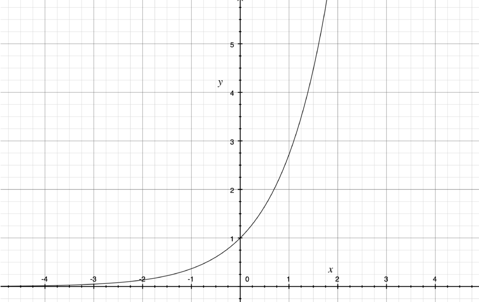
The exponential curve is one of the most powerful curves in mathematics. Notice how, on the left, the curve begins extremely flat. Then, as it progresses to the right, it gets steeper and steeper moving upward. For the most part, exponential curves occur when effects are compounded, in other words, when causes introduce effects and those effects then join up with the original causes to make a bigger cause.
The easiest way to understand this is to think about something on social media that “goes viral”. If you share a post with three people, then they each share that post with three more people, then those people, in turn, each share that post with three more people, you have an exponential curve. At the beginning, there was just me sharing a post. Therefore, only three people received the post, so my effect was minimal. However, in the second round, those three people that I shared the post with were now causes of sharing. They were the effects (they received the post), but now they have also become causes (they are themselves sharing the post). When the effect becomes the cause, you often have an exponential curve.
In school, this curve is often illustrated using money as an example—compound interest on savings. Again, the idea is the same. If I have $100 but get 1% interest on my money, the first year I will get $1 in interest (the exact amount depends on the method used for compounding). Now I have $101 in my bank account. The next year, my interest is not calculated based on my original $100, but on my new $101. The effect (the $1 I accumulated from interest) now becomes a part of my cause (the amount of money upon which I am paid interest).
An interesting thing to note about exponential curves is that, at the beginning of the curve, they look a lot like lines. Below is a zoomed-in portion of the graph on the left side of the curve:

While you can tell that there is a little bit of upward curve at the end, imagine if you were looking at a scatterplot of noisy data. It would be impossible to distinguish this from a straight line. It is only by knowing the causative structure of the numbers’ meaning that you can distinguish the early stage of an exponential curve from a generic position on a line. This is why bare extrapolation from data can be so dangerous—if you don’t know why the numbers are the way they are, you may be totally misinformed about the nature of the curve you are on.
I have seen this happen with many demonstrations of evolution. Because DNA is a code, as the size of the code gets larger, the size of the search space increases exponentially. Evolution’s ability to occur within a smaller space actually gives almost no meaningful information about its ability to occur in a larger space. On the left-hand side of the curve, the effect really looks linear. But that is a trick of exponential spaces. When we trying to extrapolate the effect out to something bigger, it goes away, because the search space grows exponentially bigger.
Evolution occurs precisely when the genome can use information to restrict the search space for evolutionary targets to a manageably small size, such as when it is modifying genes to produce antibodies for foreign invaders. The cells can’t mutate randomly and achieve success, because the search space is extremely large (about three billion base pairs). Instead, the mutation space is limited to something much more manageable, just half of an existing antibody gene (the half that attached to the invader), where the search space is still large, but manageable— six hundred base pairs. The problem gets exponentially harder as the search space increases so, contrary to conventional wisdom (see also here), what works on a small scale doesn’t work on a larger scale. The exponential space prevents it. Unfortunately, people extrapolate from the front half of the curve as if it were equivalent to the entire curve.
The S-Curve

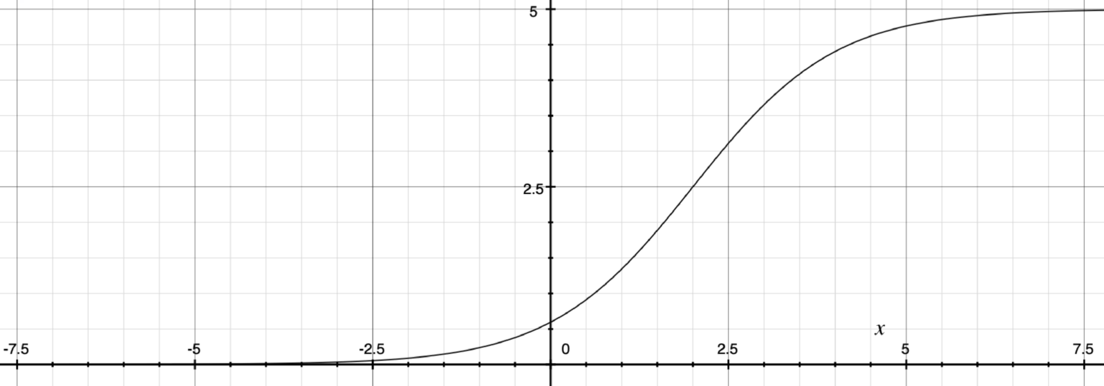
The S-curve, also known as the logistics curve, looks a lot like the exponential curve. In fact, it has a lot of the same patterns that you find in an exponential curve. On the left side, it is pretty flat. At some point, it makes a steep turn upwards. The difference between the exponential and the S-curve is that the S-curve eventually flattens out on top. The basic idea of the S-curve is that you have exponential growth with one or more limiting factors that enforces a maximum to your exponential.
It turns out that our idea of what happens when a post goes viral on social media is actually an S-curve, not an exponential. Because there is a limit to the number of people in the world, the social media post can only be forwarded and re-forwarded so many times. Eventually, the people to whom it is forwarded will already have seen it, and therefore won’t be new viewers. Thus, they probably won’t forward it again. Thus, eventually, the exponential curve gets exhausted and falls off.
The important things to remember about S-curves are that (a) they look extremely like exponential curves and (b) it is hard to tell from the early part of the curve where it will top out. Think about times you may have heard someone pitching a new investment opportunity. The sales representative may say, “Our sales growth has been exponential.” Fine, but the curve they are following is more likely an S-curve than a true exponential. So what we really need to know is not that they are currently experiencing exponential growth but rather when (at what point) might that exponential growth likely tail off.
For example, in his Tesla, Inc earnings call with investors in Q4 2018, self-driving car entrepreneur Elon Musk said “if you track Tesla vehicle production year-over-year, cumulative sales deliveries year-over-year, it is about the cleanest exponential I’ve ever seen. We’ve basically almost doubled our fleet every year. Every year, we make as many cars as we did in all prior years.” This is certainly an achievement. However, in real life, most things that start as exponentials end as S-curves. Therefore, the appropriate question to ask is where does that exponential break into something more like an S-curve?
S-curves, however, aren’t death knells. They can often be broken, but only if you are aware of them. Remember, S-curves occur because of factors that limit exponential growth. Identifying (and removing) the factors that limit exponential growth can get you back on track for more exponential growth, at least until the next limiting factor is found.
Summing It Up
Here are a few key points I hope you come away with from this article. The first is a basic understanding of the common curves that regularly arise and, most important, what drives them. The second is that data does not speak for itself. Data can, in fact, be very misleading. Within certain parameters, what looks like a line is actually an exponential, and what looks like an exponential is actually an S-curve. In order to properly understand the data, you need to know something about the causative rules that are generating the data. Along the same lines, you should never extrapolate too far from the data unless you know why you should be able to extrapolate. Remember, in the short term, many different curves look like each other (and we have only looked at three of the infinite variety of curves). To know how to extrapolate the curve, you need to also know why the curve looks like it does.
If you enjoyed this article, you might also enjoy Jonathan Bartlett’s:
Successful generalization is a key to learning In machine learning, the Solomonoff induction helps us decide how successful a generalization is
and
Machine learning tip: Set boundaries for the problems. We cannot take a giant pile of unorganized data, shove it into a machine, and expect useful results
